Am I the only one who liked the baby blues last night?
- Thread starter Siranthony
- Start date
I liked them much more than I thought I would.
The real question for me is what color scheme and design is going to be used next year when the Kings do the rebranding that I'm almost certain is in the works.
Will they stick with purple? Will they try to incorporate the baby blue as an accent? Or the script lettering for Kings? What kind of logo will we see?
Me thinks that there are too many millennials on this site that don't realize how awful the team was when they wore those horrendous uni's on a nightly basis (on the road).
Not only does the powder blue not go well with the red (those jersey's were not intended and were the result of a mistake by the manufacturer), they cause a gag reflex for many fans that lived through the 1985 - 1994 era of this team.
Best I can explain it is this.
If you've ever experienced one of those nights where you drank far too much of a certain brand of alcohol (or a specific type of adult beverage) and could no longer even look at it without getting an instant gag reflex ... that's what those power blue uni's are like for some of us.
Besides, the teams colors back then were RED, WHITE and ROYAL BLUE. Powder blue was NOT part of that color wheel. It was a mistake!
I liked them much more than I thought I would.
The real question for me is what color scheme and design is going to be used next year when the Kings do the rebranding that I'm almost certain is in the works.
Will they stick with purple? Will they try to incorporate the baby blue as an accent? Or the script lettering for Kings? What kind of logo will we see?
The real question for me is what color scheme and design is going to be used next year when the Kings do the rebranding that I'm almost certain is in the works.
Will they stick with purple? Will they try to incorporate the baby blue as an accent? Or the script lettering for Kings? What kind of logo will we see?
A couple examples:
The opening night Pin this year. The blue and purple go pretty well!


Last edited:
Franchise colors through the years. And now into Kings long future in Sacramento - firmly Purple Power!! (occasional retro Powder Blue cool)
Rochester / Cincinnati: Royal blue (red and white)
Kansas City / Omaha: Powder blue (red and white)
Sacramento: Purple (black and white) - formerly Powder blue
Rochester / Cincinnati: Royal blue (red and white)
Kansas City / Omaha: Powder blue (red and white)
Sacramento: Purple (black and white) - formerly Powder blue
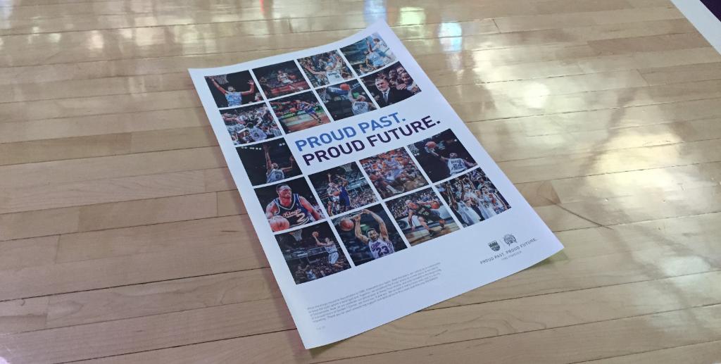
I've actually been thinking quite a lot about this. The current Kings branding is using both the baby blue to Remember the past, and the purple to look toward the future. I can try to find some examples of recent material they've used. I wouldn't think the combo works until I've seen it recently on their marketing material and I actually think this may be the direction they are going.
A couple examples:
The opening night Pin this year. The blue and purple go pretty well!


A couple examples:
The opening night Pin this year. The blue and purple go pretty well!


Speaking of pins...
I remember the Kings dropping the ball last year and forgetting the pins for opening night or something like that.
whatever happened with that?
I think there's probably a 90% chance the Kings rebrand next year.. The question is, do they keep the name? What will the color scheme be?
That color scheme is the Hornets.
I wouldn't mind Florida themed jersey.

I've actually been thinking quite a lot about this. The current Kings branding is using both the baby blue to Remember the past, and the purple to look toward the future. I can try to find some examples of recent material they've used. I wouldn't think the combo works until I've seen it recently on their marketing material and I actually think this may be the direction they are going.
A couple examples:
The opening night Pin this year. The blue and purple go pretty well!

A couple examples:
The opening night Pin this year. The blue and purple go pretty well!

I wouldn't mind Florida themed jersey.

The old baby blues looked good and could pass for home jerseys but the black of opening night should be shelved as home informs forever. Get rid of the black at home ncluding the black warm-up sweats. Love th various whites we have worn at home.
I think there's probably a 90% chance the Kings rebrand next year.. The question is, do they keep the name? What will the color scheme be?
Speaking of pins...
I remember the Kings dropping the ball last year and forgetting the pins for opening night or something like that.
whatever happened with that?
I remember the Kings dropping the ball last year and forgetting the pins for opening night or something like that.
whatever happened with that?
I've actually been thinking quite a lot about this. The current Kings branding is using both the baby blue to Remember the past, and the purple to look toward the future. I can try to find some examples of recent material they've used. I wouldn't think the combo works until I've seen it recently on their marketing material and I actually think this may be the direction they are going.
A couple examples:
The opening night Pin this year. The blue and purple go pretty well!


A couple examples:
The opening night Pin this year. The blue and purple go pretty well!

