New Alternate Court Floor

Capt. Factorial

trifolium contra tempestatem subrigere certum est
Staff member
#1
http://www.nba.com/kings/news/kings-debut-new-alternative-court-global-uniform


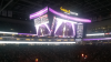
The Kings have announced a new alternate court floor to be used when the "global" uniform is used at home (this would be at least the "Bollywood Night", the "Chinese New Year Night", and probably other instances as well). I don't believe the "global" uniform has been announced yet, but I would guess it will be a black theme to match the court.

The article mentions that the Kings will use the same court as last year when wearing the "Association"/"Icon" (White/Purple) uniforms, and that there will be a third court associated with a fourth uniform announced during the season.

(Sorry about the huge image, it seems to be the only one available.)
 
Last edited:
#7
Love love love love it. Tiniest of gripes, I do wish there was a hint of purple somewhere.
The color scheme of the court is actually incomplete without players in uniform.

This is an intelligent design, it provides a backdrop to the players uniforms... which have purple. This is going to look fantastic.

It's an alternate so that's good, very good. I'm pretty sure any kid could have put that together in NBA 2K with presets, lol.
Nope. You think that, because it is simple. But elegant simplicity is hard to achieve. Every single kid who would have designed some kind of court would have overdone it (same with most graphic artists) - too many colors, too many graphics, too much text. This is excellent, high level work. Bold, clean, memorable, and does not distract from the action on the court.
 
Last edited:

SLAB

Hall of Famer
#8
^^^ Did the global uniform actually have purple on it? As far as I remember, it didn't.

(I know there's a chance it gets changed with the Nike switch, but the two uniforms already revealed wee pretty much the same)
 

Capt. Factorial

trifolium contra tempestatem subrigere certum est
Staff member
#9
^^^ Did the global uniform actually have purple on it? As far as I remember, it didn't.
No, I believe the only purple in the Global uniform is on a Kings logo patch.

I can take or leave the heraldic lion (I know some people really like it) but the big issue with this particular floor/uniform combo to me is apparently a complete lack of purple. But I'll live.
 
#10
The color scheme of the court is actually incomplete without players in uniform.

This is an intelligent design, it provides a backdrop to the players uniforms... which have purple. This is going to look fantastic.


Nope. You think that, because it is simple. But elegant simplicity is hard to achieve. Every single kid who would have designed some kind of court would have overdone it (same with most graphic artists) - too many colors, too many graphics, too much text. This is excellent, high level work. Bold, clean, memorable, and does not distract from the action on the court.

Which is what the 2K games are like, haha.

Depends on your definition of overdone. I'm OK with simplistic but on the other end of the spectrum is 2 dimensional and flat. The finish should aid a bit with that though. If they play with the black uniforms on the floor I think that may be very apparent if and when that happens. For an alternate floor for special occasions it's OK though and will be something different to break up the monotony I guess. I'm not a big fan of the Nets home court either, and this is literally even more stripped down with a single color in the logo area. I think the NBA has really regressed in both uniform design and in all aspects of design in the last couple of years.
 
#11
^^^ Did the global uniform actually have purple on it? As far as I remember, it didn't.

(I know there's a chance it gets changed with the Nike switch, but the two uniforms already revealed wee pretty much the same)
There's a tiny touch. There will be purple on screen though, fans jerseys, score box, etc. I grant you it will be very understated, which is why it will be an "alternate". Not something you can do all the time nor should it be the main. It will feel special, kind of like dressing up.
 
#12
Which is what the 2K games are like, haha.

Depends on your definition of overdone. I'm OK with simplistic but on the other end of the spectrum is 2 dimensional and flat. The finish should aid a bit with that though. If they play with the black uniforms on the floor I think that may be very apparent if and when that happens. For an alternate floor for special occasions it's OK though and will be something different to break up the monotony I guess. I'm not a big fan of the Nets home court either, and this is literally even more stripped down with a single color in the logo area. I think the NBA has really regressed in both uniform design and in all aspects of design in the last couple of years.
I personally think the Nets' is a bit too simple because it is also graphically retro style.

This has a big regal lion front/center so I think it will avoid that low rent look that I think the Nets slip into.
 
Last edited:

VF21

Super Moderator Emeritus
SME
#14
Which is what the 2K games are like, haha.

Depends on your definition of overdone. I'm OK with simplistic but on the other end of the spectrum is 2 dimensional and flat. The finish should aid a bit with that though. If they play with the black uniforms on the floor I think that may be very apparent if and when that happens. For an alternate floor for special occasions it's OK though and will be something different to break up the monotony I guess. I'm not a big fan of the Nets home court either, and this is literally even more stripped down with a single color in the logo area. I think the NBA has really regressed in both uniform design and in all aspects of design in the last couple of years.
I strongly suspect there may be a purple light involved with this court. Having seen what they can do with optics, I don't believe it's quite as simple as what we see here. I strongly suspect they're holding something back.
 
#15
I strongly suspect there may be a purple light involved with this court. Having seen what they can do with optics, I don't believe it's quite as simple as what we see here. I strongly suspect they're holding something back.

Literally? Purple strobe lighting anyone? haha.

We'll have to see it in reality because indeed a picture doesn't exactly show what it will look like because texture, finish, etc. will play a part in the overall look. I think the most beneficial part of the design is that the Golden1 logo seemingly blends in well with it. That in itself is probably the most genius part of it IMO.
 

VF21

Super Moderator Emeritus
SME
#16
Literally? Purple strobe lighting anyone? haha.

We'll have to see it in reality because indeed a picture doesn't exactly show what it will look like because texture, finish, etc. will play a part in the overall look. I think the most beneficial part of the design is that the Golden1 logo seemingly blends in well with it. That in itself is probably the most genius part of it IMO.
Have you been to any games at G1C? It's hard to explain if you haven't been there.

upload_2017-9-15_15-19-57.png

This doesn't show the court but there was a purple light on the floor during the introductions. It wasn't there when the house lights came up.
 
#18
Literally? Purple strobe lighting anyone? haha.

We'll have to see it in reality because indeed a picture doesn't exactly show what it will look like because texture, finish, etc. will play a part in the overall look. I think the most beneficial part of the design is that the Golden1 logo seemingly blends in well with it. That in itself is probably the most genius part of it IMO.
Yeah the lighting is crazy.